The Arabic Script: How One of the World's Most Beautiful Writing Systems Works
The Arabic script is used by over 400 million people and is the second most widely used writing system in the world. From its 28 shape-shifting letters to the art of calligraphy, here's how this remarkable system works.
Lingo Service
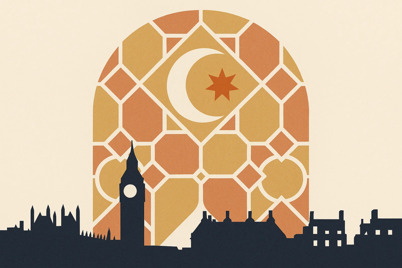
The Arabic script is the second most widely used writing system in the world, after the Latin alphabet. Over 400 million people use it as their primary script, and it's employed not just for Arabic but for Persian (Farsi), Urdu, Pashto, Kurdish (Sorani), and historically for Turkish, Malay, and several African languages. Its flowing, connected forms have made it one of the world's great artistic traditions.
Understanding how the Arabic script works isn't just an academic exercise — it has practical implications for anyone commissioning Arabic translation, designing bilingual documents, or working with Arabic digital content.
A Brief History
The Arabic script evolved from the Nabataean alphabet, itself derived from Aramaic, which traces back to the Phoenician script — the same ancestor as the Latin, Greek, and Hebrew alphabets. The earliest Arabic inscriptions date to the 1st century CE, but the script truly flourished after the rise of Islam in the 7th century, when the need to accurately preserve the Quran drove rapid standardisation and refinement.
By the 8th century, Arabic calligraphy had become both a practical writing system and a sophisticated art form. Because Islamic tradition generally discourages figurative art in religious contexts, calligraphy became the supreme visual art of Islamic civilisation — adorning mosques, palaces, coins, textiles, and ceramics across three continents.
The 28 Letters
The Arabic alphabet contains 28 letters, all consonants. Arabic is written from right to left, and most letters connect to the letters next to them in a word, creating a flowing, cursive script. Only six letters (alif, dal, dhal, ra, zay, and waw) connect to the preceding letter but not the following one.
What makes Arabic visually complex is that most letters have four different forms depending on their position in a word:
- Isolated — the letter standing alone
- Initial — at the beginning of a word (connects to the left)
- Medial — in the middle of a word (connects both sides)
- Final — at the end of a word (connects to the right)
For example, the letter "ayn" (ع) looks quite different in each position: ع (isolated), عـ (initial), ـعـ (medial), ـع (final). To a non-Arabic reader, these can appear to be entirely different characters. An Arabic reader processes these variations instinctively, just as English readers don't consciously think about "a" and "A" being the same letter.
Vowels: The Hidden Layer
Standard Arabic text writes only consonants and long vowels. Short vowels are typically not written — readers infer them from context and their knowledge of the language. The word k-t-b could be kataba (he wrote), kutiba (it was written), or kutub (books), depending on context.
This system works well for fluent readers but creates challenges for language learners, computer processing, and situations where ambiguity is unacceptable. For these cases, Arabic has a system of tashkeel (تشكيل) — small marks placed above or below letters to indicate short vowels, doubling (shadda), and the absence of a vowel (sukun).
Tashkeel is always used in:
- The Quran (to preserve exact pronunciation)
- Children's books and educational materials
- Poetry (where metre depends on exact vowel patterns)
- Ambiguous words where context alone isn't sufficient
Most adult Arabic text — newspapers, business documents, websites — omits tashkeel entirely. This is important for Arabic proofreading, where a native editor's ability to infer correct vowels from context is essential for quality assurance.
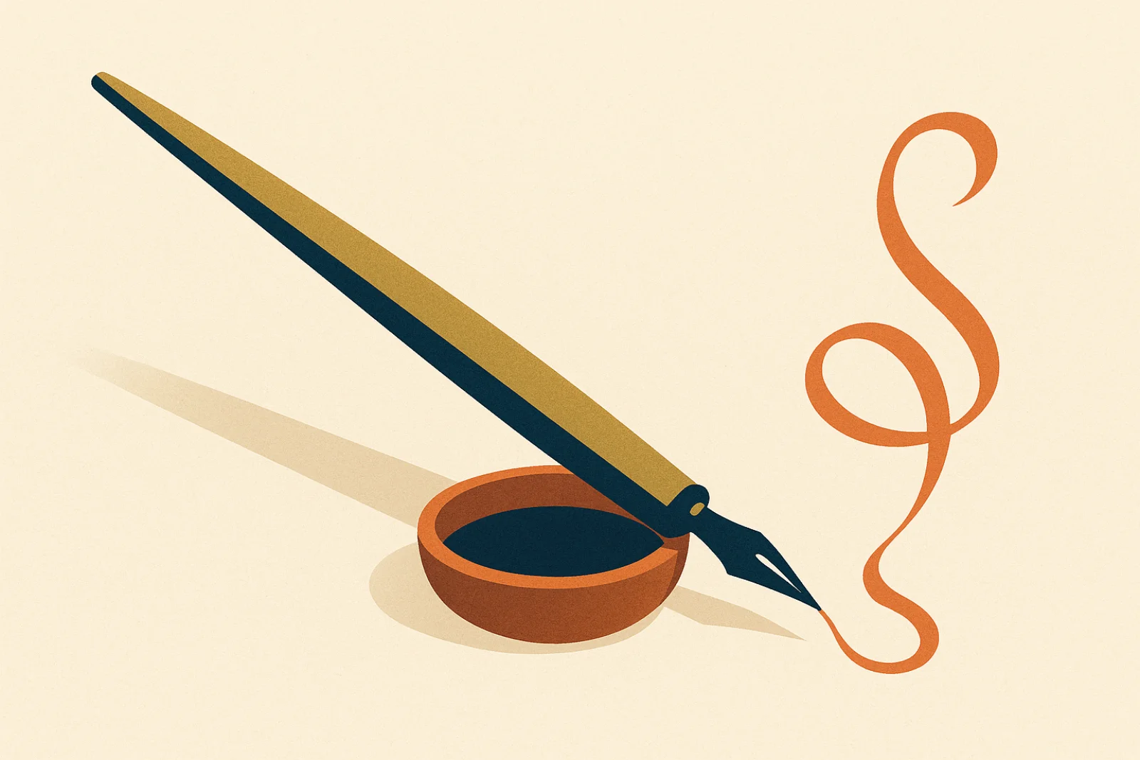
Major Calligraphic Styles
Arabic calligraphy has developed numerous styles over 1,400 years. The most important for modern use are:
Naskh is the standard style used in printing, digital text, and most everyday writing. It's clear, readable, and forms the basis of Arabic typefaces on computers and phones. When you see Arabic text on a website or in a document, it's almost certainly set in a Naskh-based font. This is the style relevant to Arabic desktop publishing and document design.
Nastaliq is used primarily for Urdu, Persian, and other languages that adopted the Arabic script. It has a distinctive sloping, hanging quality that makes it visually stunning but more complex to typeset. Our Arabic-Urdu translation projects often involve Nastaliq typography.
Thuluth is an ornamental style used for titles, headings, and architectural inscriptions. You'll see it on mosque walls, book covers, and official documents. It's the "display font" of Arabic calligraphy.
Diwani was developed by Ottoman calligraphers for official court documents. It's highly decorative and difficult to read for non-specialists, which was partly the point — it served as a form of document security.
Kufi is the oldest calligraphic style, angular and geometric, used in early Quran manuscripts and now popular in logos, architectural decoration, and modern Arabic graphic design.
Digital Challenges
Displaying Arabic correctly on screens presents technical challenges that don't exist for Latin-script languages:
Letter joining: Arabic fonts must automatically select the correct form of each letter based on its position. If the joining algorithm fails, Arabic text appears as disconnected letters — visually wrong and sometimes unreadable.
Bidirectional text: Arabic text runs right-to-left, but numbers, Latin words, and punctuation within Arabic text run left-to-right. A single paragraph can switch direction multiple times. Web browsers and apps must use the Unicode Bidirectional Algorithm to handle this correctly, and getting it wrong is one of the most common bugs in Arabic software localisation.
Text expansion: Arabic text is often more compact than English (around 15-20% shorter by character count), but the visual width depends heavily on the font and letter combinations. Arabic desktop publishing requires careful attention to text box sizing and line breaks.
Font support: Not all fonts support Arabic, and among those that do, quality varies enormously. Professional Arabic documents require fonts that handle all letter forms, ligatures (special combined forms), and tashkeel marks correctly. Google's Noto Sans Arabic and Adobe's Arabic type families are among the most reliable for digital use.
Why This Matters for Translation
Understanding the Arabic script isn't just about linguistics — it has practical implications for every Arabic translation project:
- Document formatting: Arabic documents need right-to-left formatting, appropriate fonts, and correct text alignment. A translated birth certificate that doesn't handle Arabic text correctly looks unprofessional and may be rejected.
- Website design: Arabic websites need mirrored layouts, RTL CSS, and bidirectional text support. See our website translation services.
- Quality assurance: Broken letter joining, incorrect tashkeel, or bidirectional text bugs are invisible to non-Arabic readers but immediately obvious to Arabic speakers. Professional Arabic proofreading catches these issues.
At Arabic Translation UK, we don't just translate words — we ensure your Arabic content looks right, reads naturally, and meets the visual expectations of Arabic-speaking audiences. Contact us to discuss your Arabic project.
Topics
Lingo Service
Professional Translation Services Since 2012
Trusted by UK solicitors, businesses and government. Arabic translation specialists, UKVI certified.
Enjoyed this article?
Share it with your network